SAS-SCHULZ-MC2
VAST Challenge 2022
Challenge 2
Team Information
Team members:
- Falko Schulz, SAS Institute, Falko.Schulz@sas.com (PRIMARY)
- Don Chapman, SAS Institute, Don.Chapman@sas.com
- Steven Harenberg, SAS Institute, Steven.Harenberg@sas.com
- Stu Sztukowski, SAS Institute, Stu.Sztukowski@sas.com
- Cheryl LeSaint, SAS Institute, Cheryl.LeSaint@sas.com
Student team?
No
Analytics tools used:
Approximately how many hours were spent working on this submission in total?
100 hours
May we post your submission in the Visual Analytics Benchmark Repository after VAST Challenge 2022 is complete?
Yes
Video
Questions
Question 1 | Question 2 | Question 3 | Question 4
Patterns of Life considers the patterns of daily life throughout the city. You will describe the daily routines for some representative people, characterize the travel patterns to identify potential bottlenecks or hazards, and examine how these patterns change over time and seasons.
NOTE
The answer form contains interactive visualizations that rely on content hosted on GitHub pages and CDNs. If you encounter issues with these visualizations first try viewing in Chrome and disabling any ad blocking. If the interactive visuals still do not work a static fallback version can be forced by clicking this link:
1Assuming the volunteers are representative of the city's population, characterize the distinct areas of the city that you identify. For each area you identify, provide your rationale and supporting data.
Limit your response to 10 images and 500 words.
Using the transactional data of the participant's daily routines we identified various distinct areas in the city. Particularly, the city can be divided into areas with residential and business use.
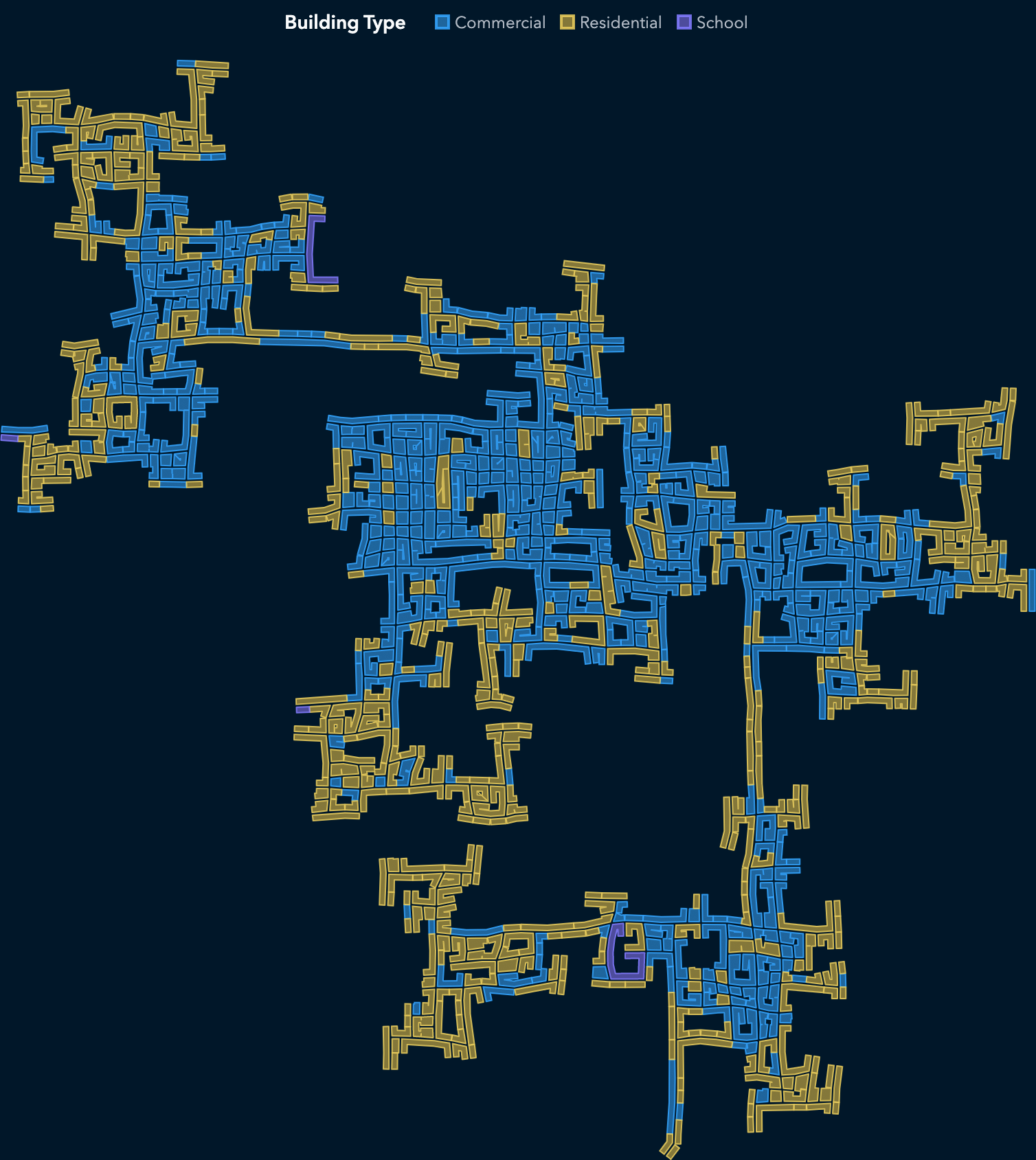
Most of the residential buildings (shown as yellow in the figure below) are in the outer areas of the city which means long commutes to business locations (shown as red). Combining the business district heat map and residential information reveals a potential source of bottlenecks during peak hours as employees travel from the outer city areas into each of the business districts.
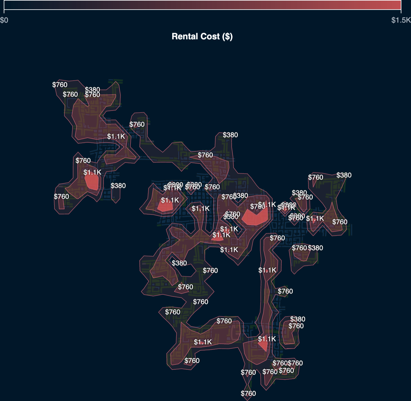
Comparing residential rental costs for different areas of the city reveals that many high-cost apartments are close to the city center and in close proximity to business locations.
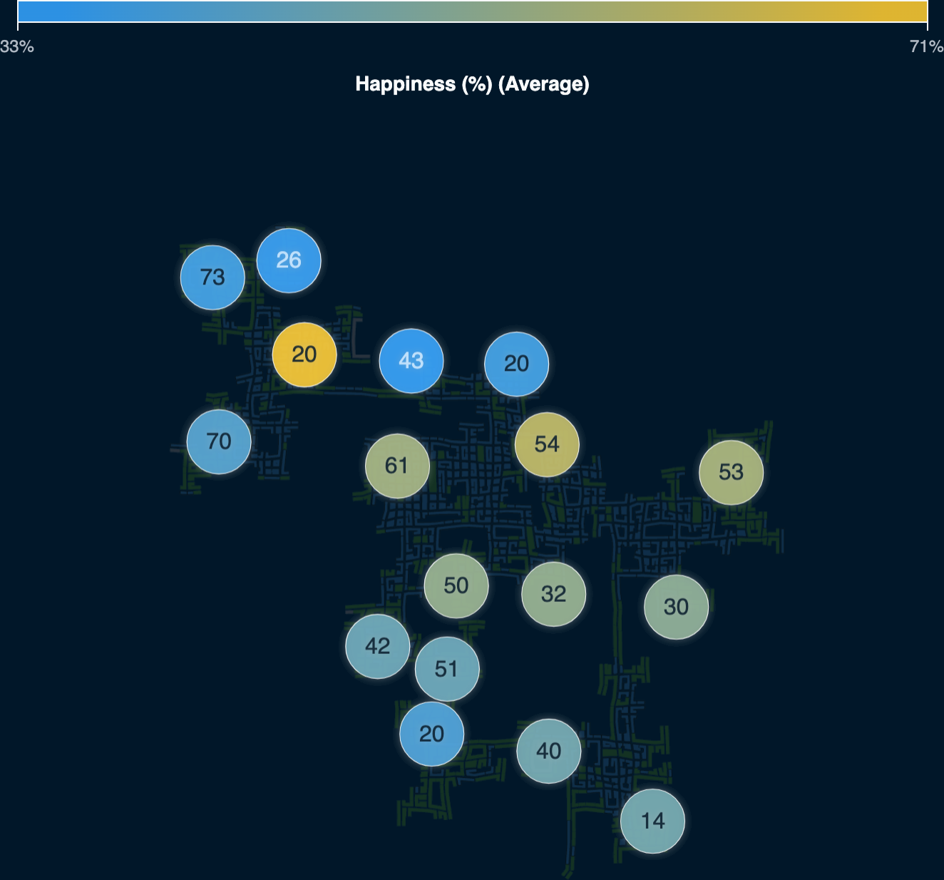
Looking into the happiness score for participants shows that the majority of people are happier if they live close to the center of the city. Likely shorter commutes, better access to facilities, and employment options contribute.
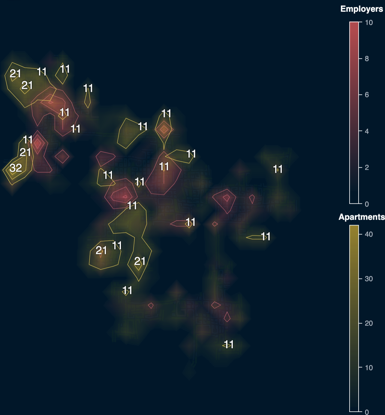
Because some buildings contain both businesses and apartments we need to further in on specific business locations using the employer data. Using a heat map visualization of employer locations we discovered three business hubs within the city.

For brevity the business districts will be reference using this acronyms going forward:
- NWD = North West District
- CBD = Central Business District
- EBD = East Business District
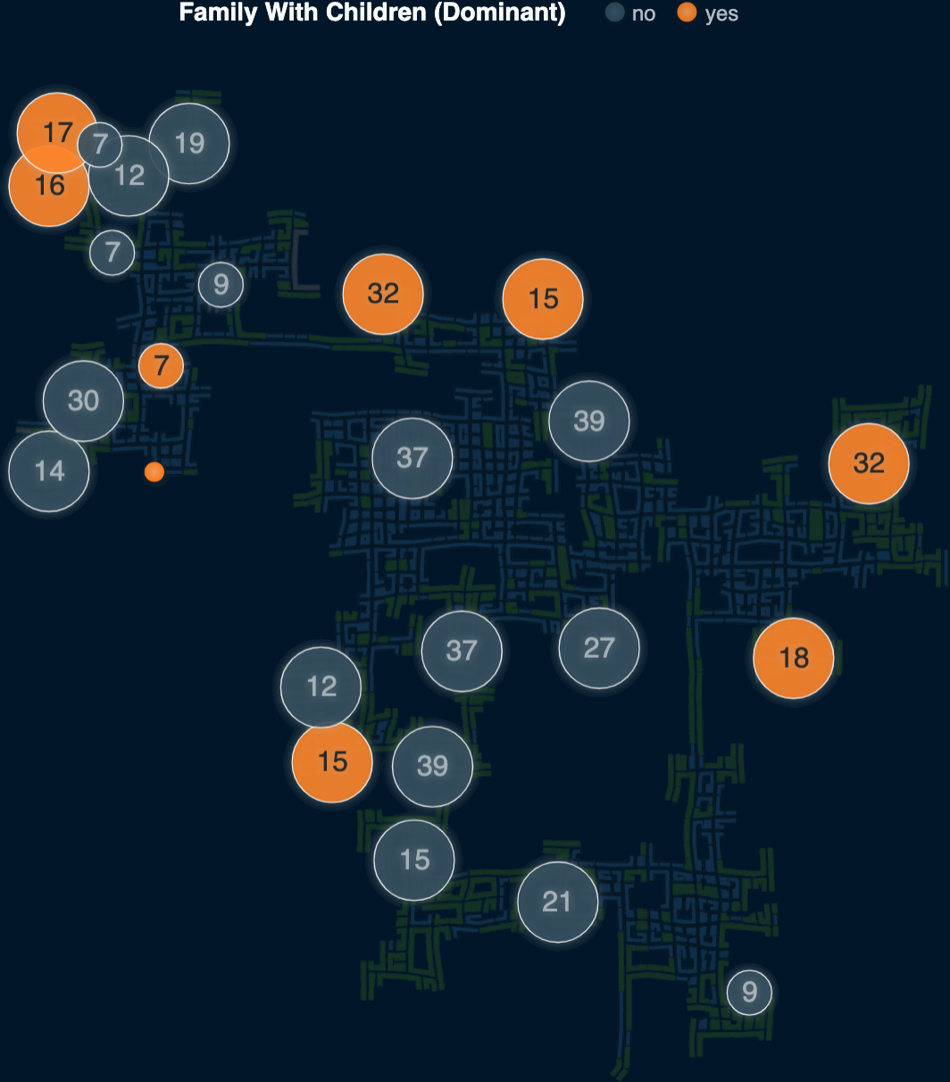
By identifying family homes as those where the household size is greater than one we are able to identify where family residences and potentially children are located.
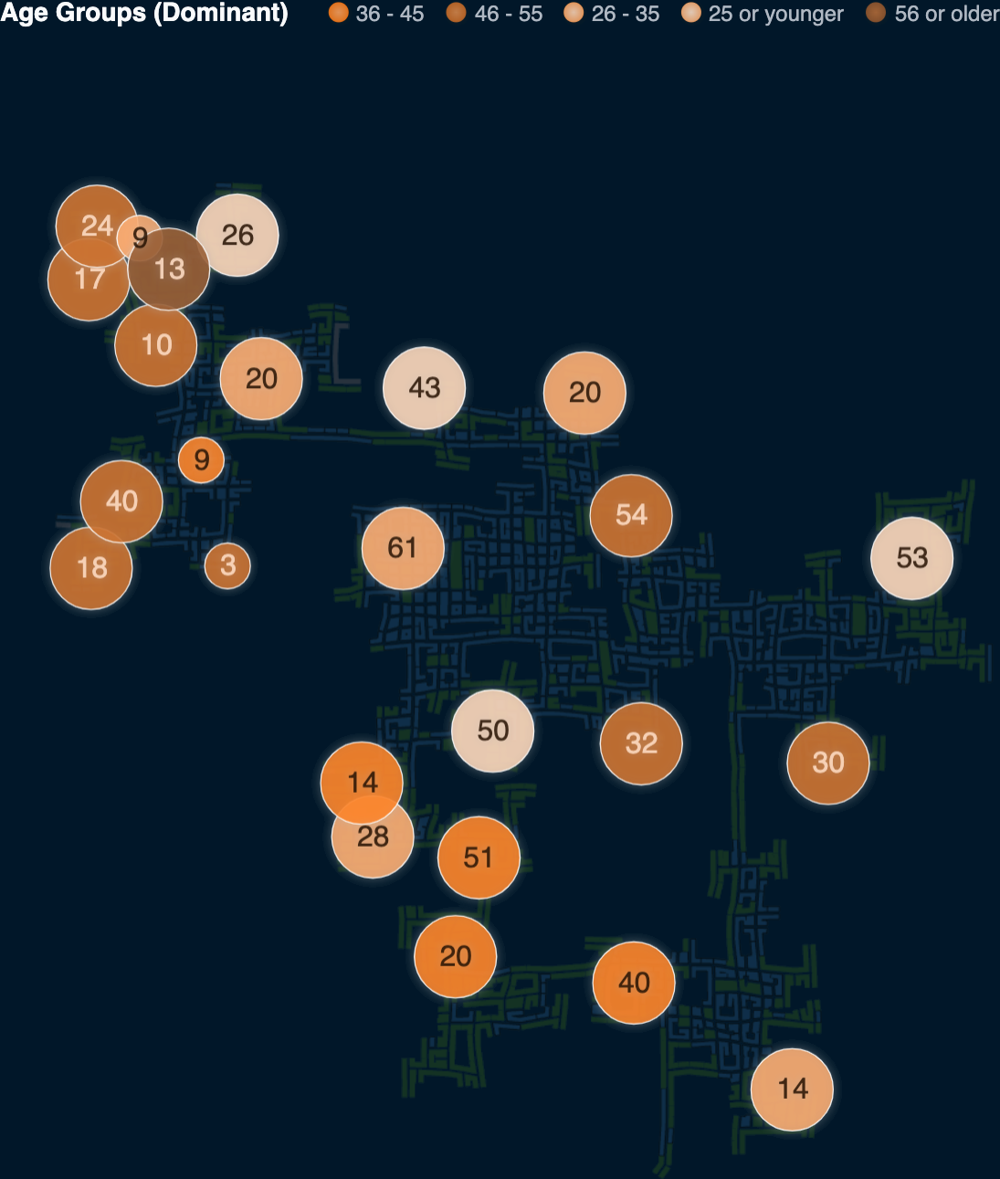
Dividing homes by age group shows that younger generations are drawn towards the city center. Older people tend to live further out with especially high concentration in the north-west part of the city.
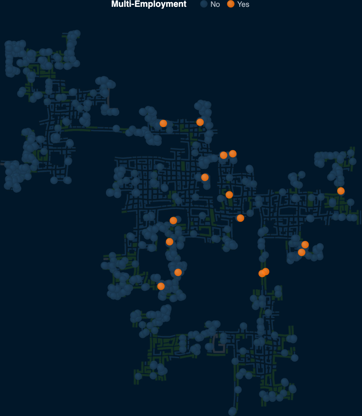
Participants with more than one job typically live closer to the city center, presumably in order to be able to make it to multiple jobs without lengthy commutes.
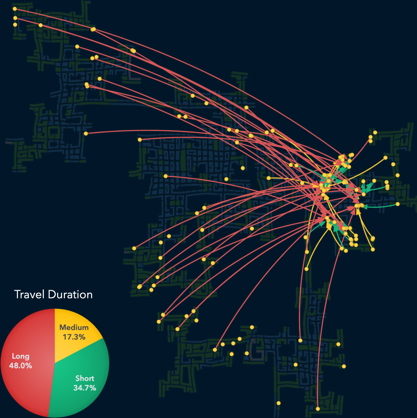
2Where are the busiest areas in Engagement? Are there traffic bottlenecks that should be addressed? Explain your rationale.
Limit your response to 10 images and 500 words.
The traffic patterns of the city depend very much upon the time of the day. There are several potential areas of concern. Many people are commuting to work and increased traffic is measurable during 8-9AM and 4-5PM each day. In particular the two connecting gateways in the north and south east show consistent traffic bottlenecks at peak hours.

Breaking down the traffic patterns based on the business district they are traveling to reveal more nuanced patterns. For example, almost 50% of all employees traveling to the Eastern Business District do so from the western parts of the city, which can take over an hour.
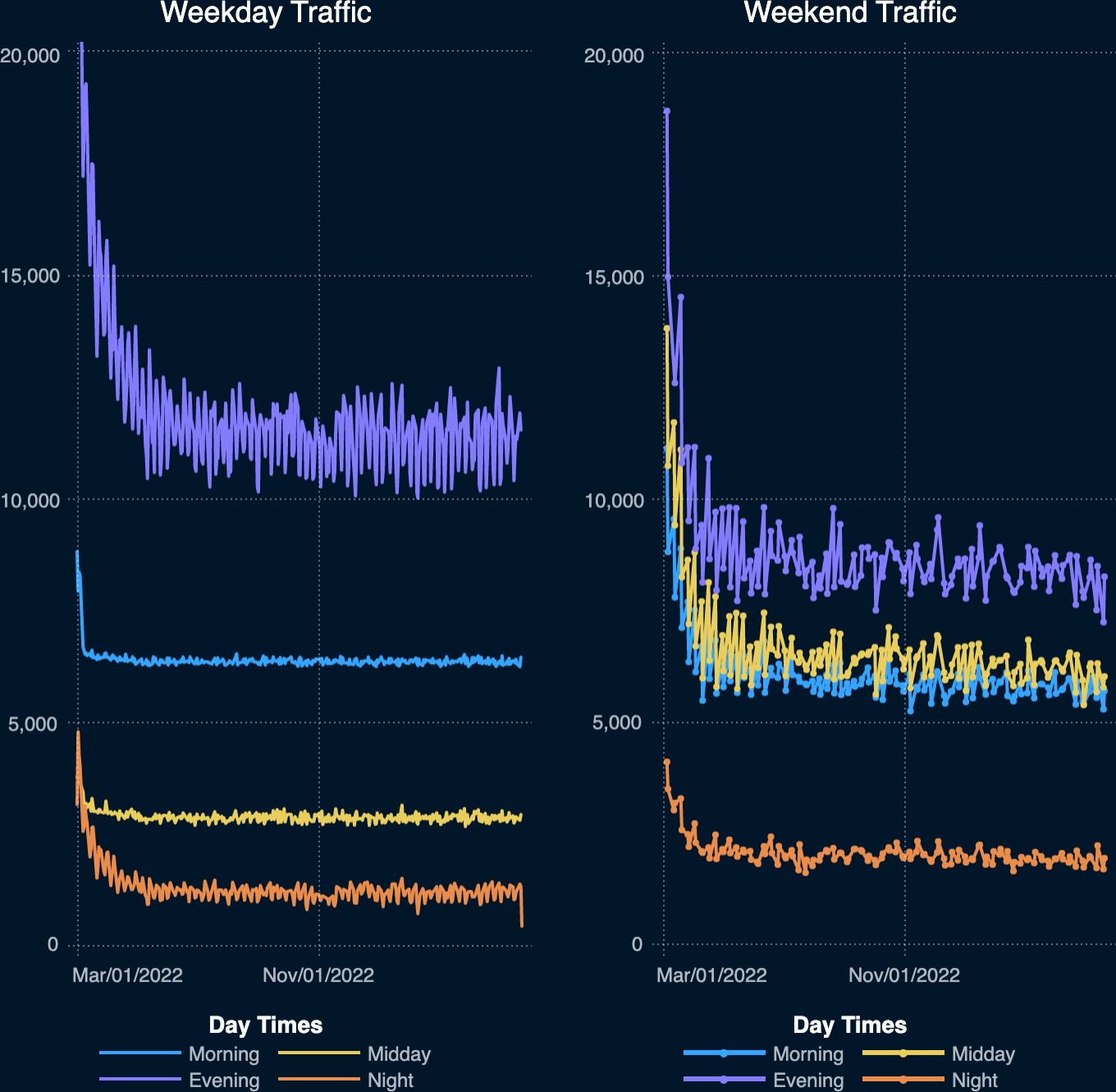
Comparing travel during weekdays and weekends reveals very different patterns. For instance, the average mid-day traffic (11AM-3PM) on weekends is twice as high as on business days. In contrast, evening traffic is always higher on weekdays.
3Participants have given permission to have their daily routines captured. Choose two different participants with different routines and describe their daily patterns, with supporting evidence.
Limit your response to 10 images and 500 words.
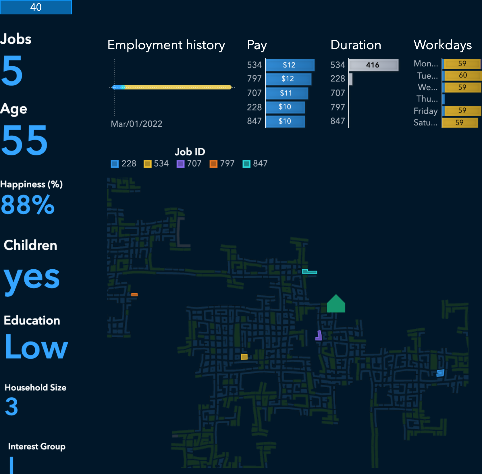
Participant 40
We have selected participant 40 as our first case study. This 55-year old lives in a household of three with children and works for two employers during the year. Initially working at jobId 228 this participant tried three other jobs for a few days until jobId 534 was accepted in April 2022. The change in employment is also reflected in the change of daily travel pattern. Workdays changed from Monday through Friday at jobId 228 to Friday through Wednesday at jobId 534. The participant also received a pay increase ($2) for jobId 534.
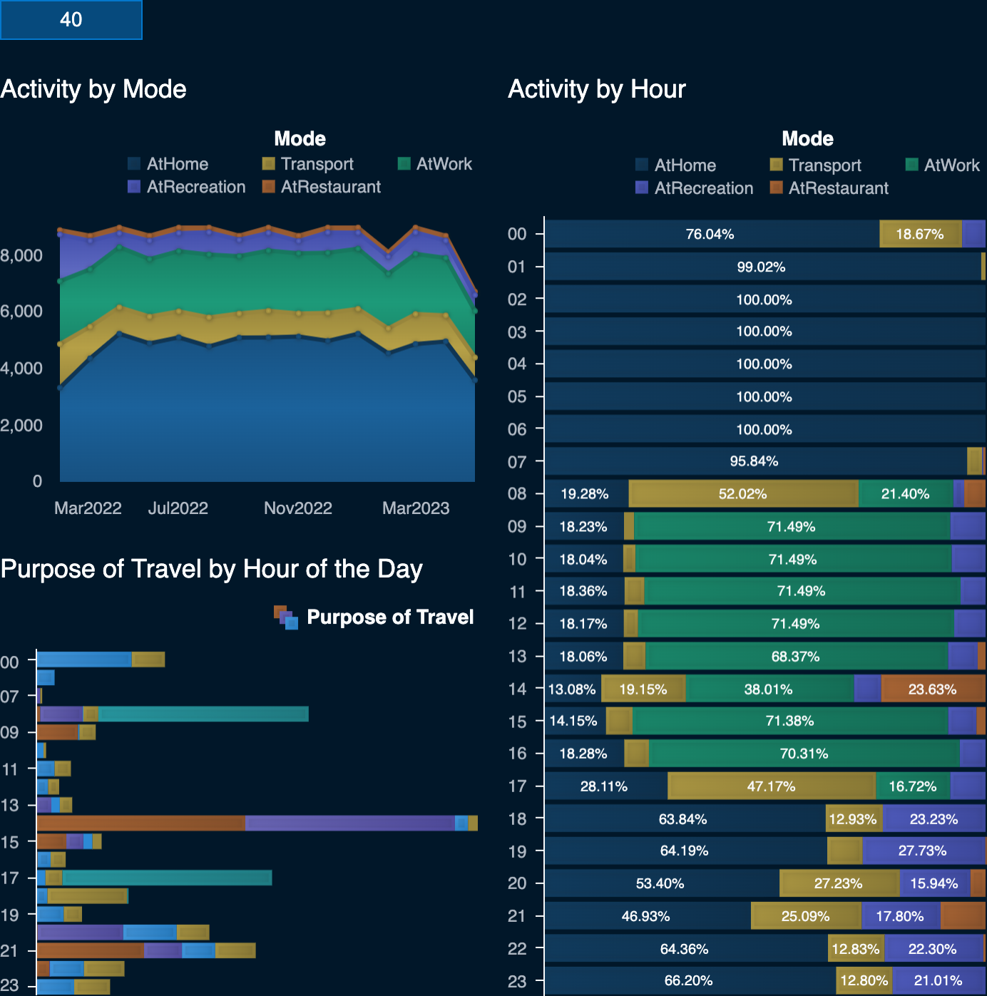
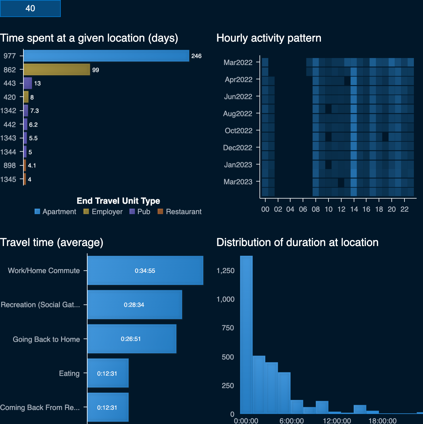
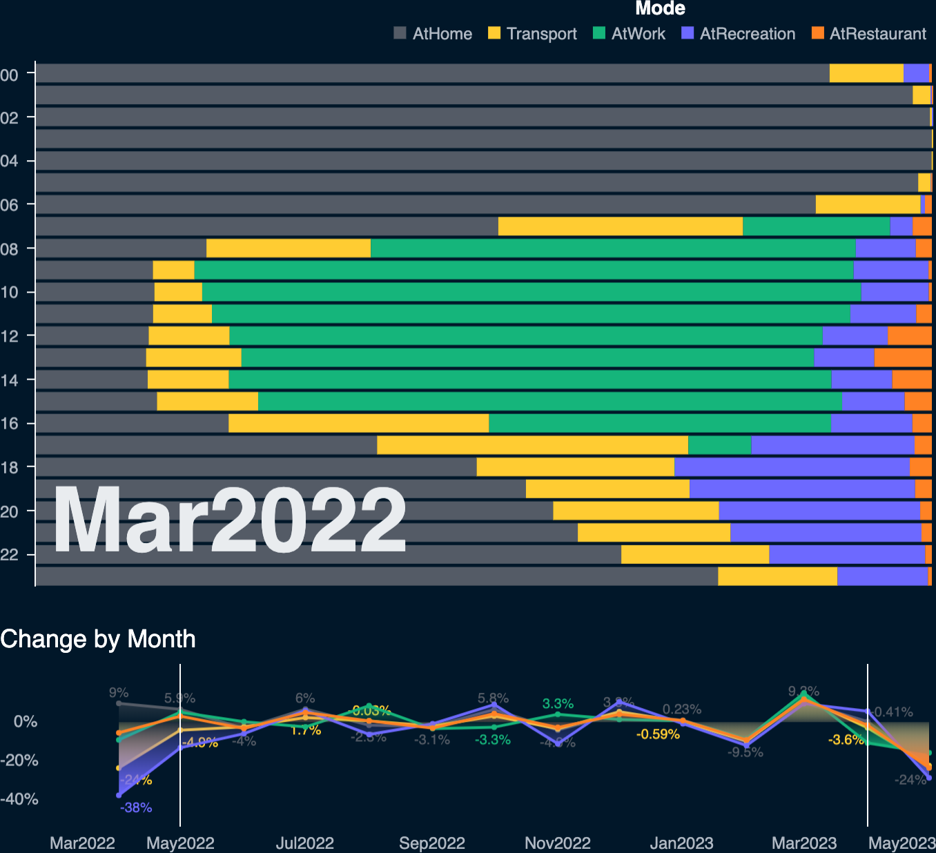
Participant 40's activity dashboard reveals their daily life. The participant was typically at home between 1-7pm or engaged in recreational activities between 6-23pm. Lunches were usually eaten at a restaurant at 2pm.
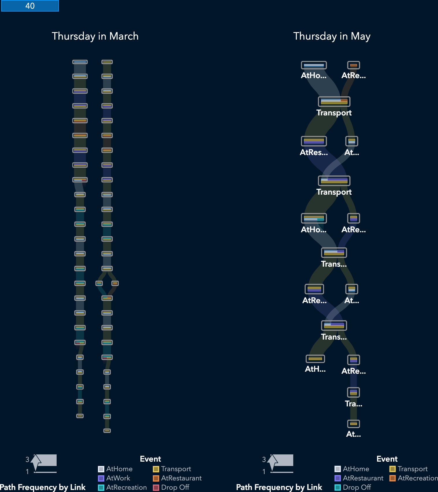
After April the change in employment changed the participants routine significantly. Thursday's schedule in particular is different since they no longer worked that day. The following figure shows a transition from a typical workday route (Home > Work > Restaurant (Lunch) > Work) in March to a more weekend style routine (Home > Restaurant > Home) in May.
Not surprisingly participant 40 spends most of their time during the year at home (apartmentId 977) and working for jobId 534 (employerId 862). They also visited various pubs and restaurants during that time, with pubId 443 being the favorite lunch location.
The participant travels mostly at 8am and 2pm to commute to work and nearly as frequently at 5pm to restaurants and pubs. On average the participants spends a bit more than 30min commuting to and from work and only 12 minutes traveling to eat.
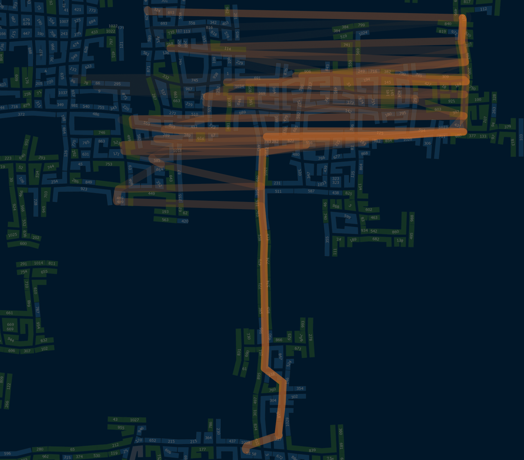
More detailed examination of travel routes shows the change in workplace. Participant 40 changed to jobId 534 in April after working for one month (34 days) at jobId 228. They stayed at job 534 for the reminder of the year. Comparing daily routines between March and April reflects the new home to work commute.
Viewing travel for a single day (March 1st 2022) shows the participant's typical commute and restaurant visits.
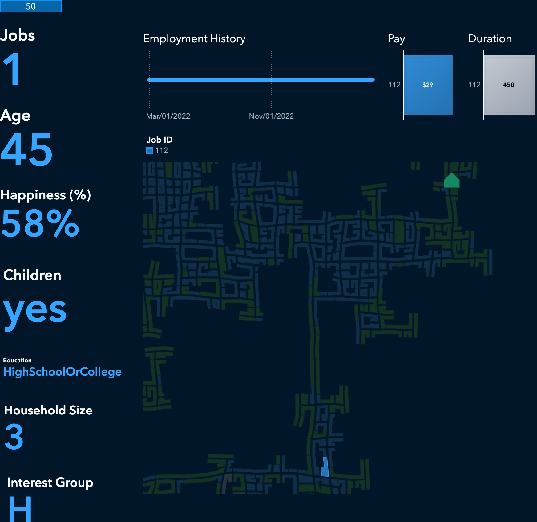
Participant 50
The second participant example is participant 50. This 45 year old, educated person lives in a three person household. They had a single job during the entire study, working from Sunday to Thursday each day. This participant earns more than twice as much ($29) as participant 40.
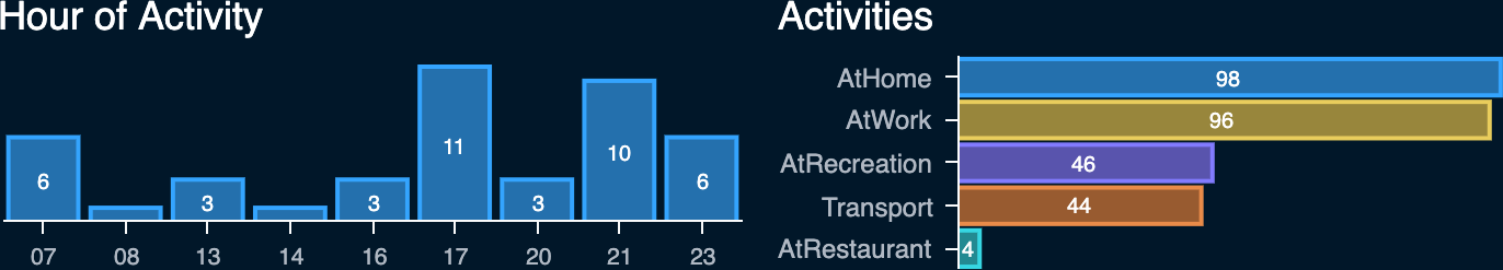
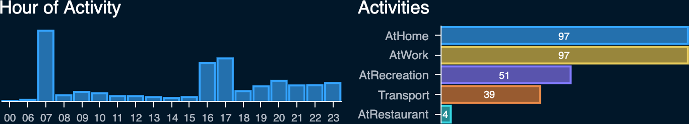
The activity dashboard in the following figure reveals a similar daily pattern as the previous participant. However, they don't eat at a restaurant for lunch, instead eat at restaurants for breakfast (8-10am) and dinner (7-22pm). This participants also more frequently travels to recreational activities after work between 6-22pm.
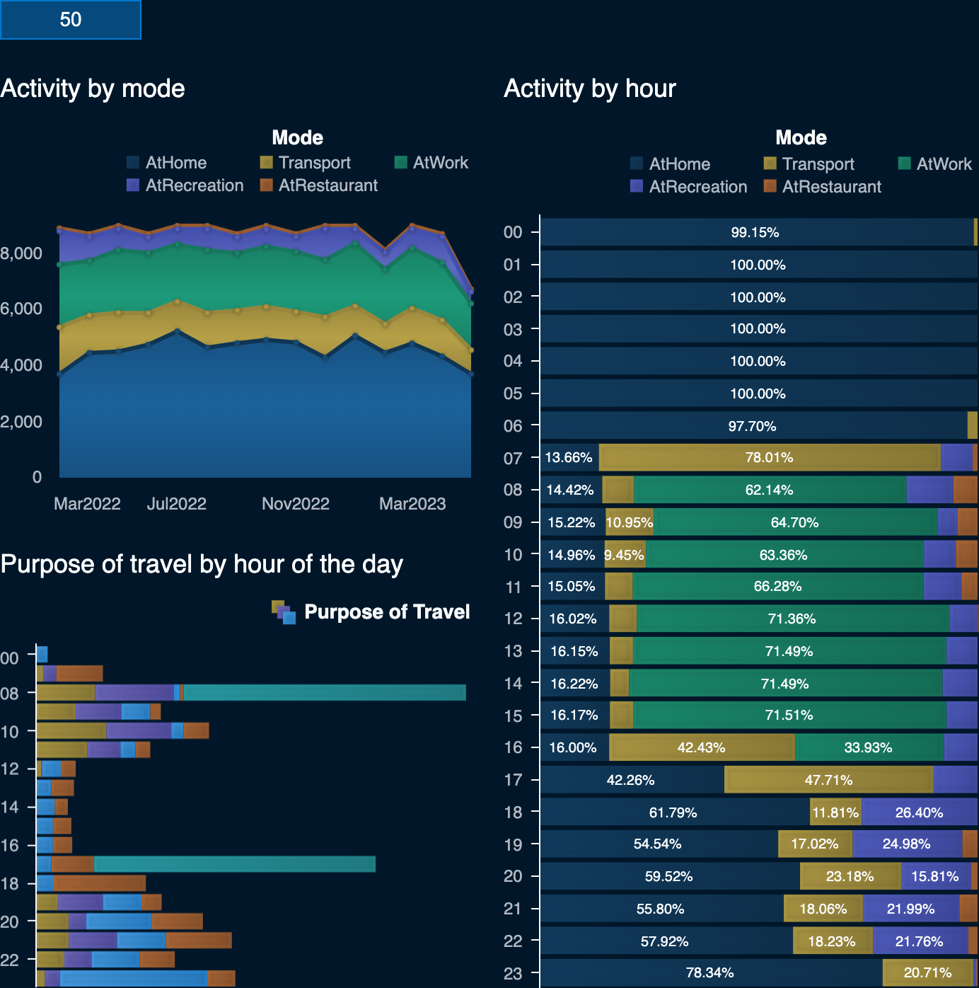
Most of their time is spent at home, followed by their place of work (employerId 400). 8am and 5pm are the busiest times of the day for this participant when they are commuting to and from work. They have significantly longer commutes, on average 1 hour, which are twice as long as participant 40's commutes.
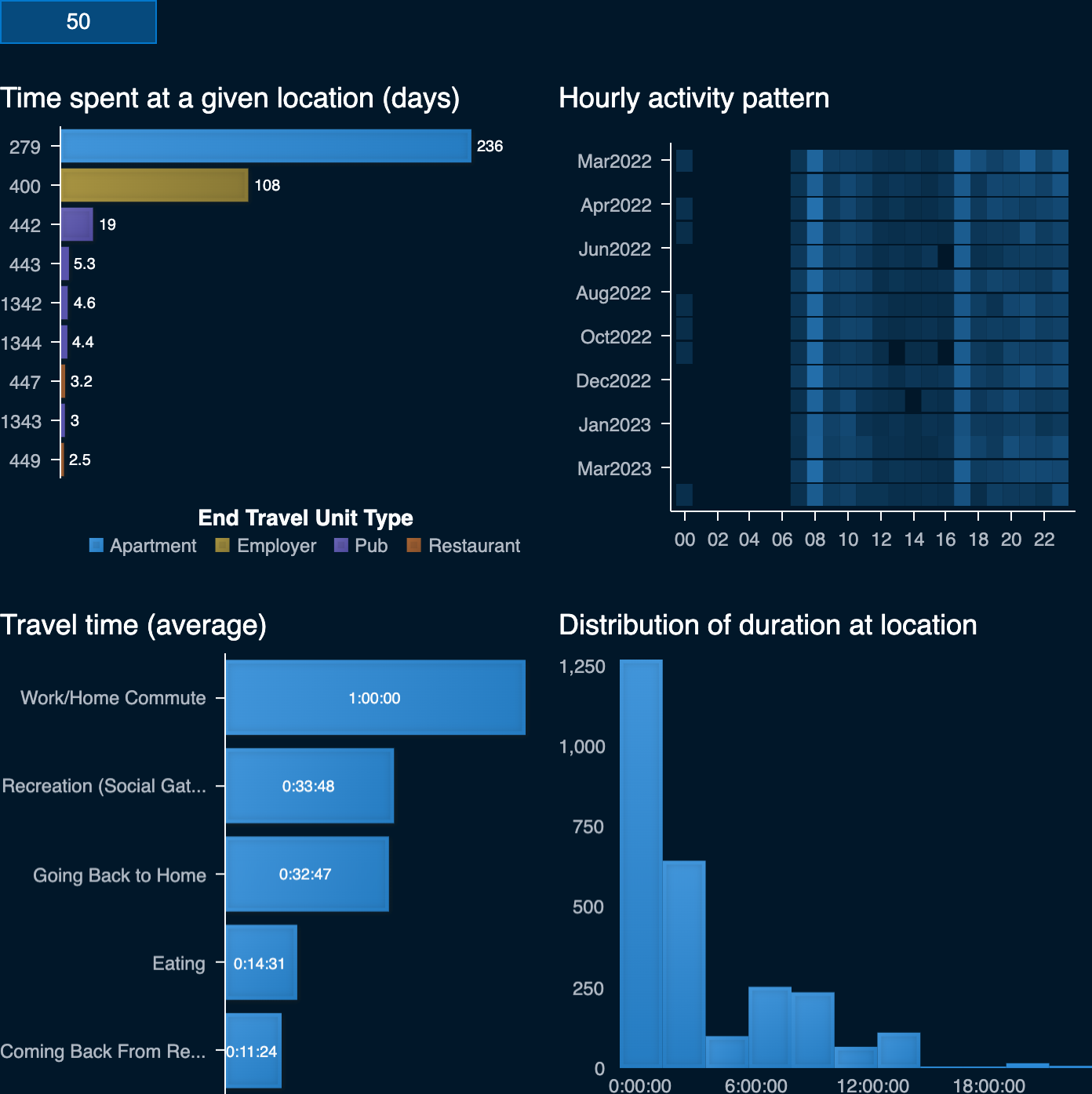
With only one job during the entire year the travel pattern for participant 50 does not change much. They are primarily active in the north eastern part of the city with daily commute to work in the the southern part of the city.
4Over the span of the dataset, how do patterns change in the city change? Describe up to 10 significant changes, with supporting evidence.
Limit your response to 10 images and 500 words.
Overall activity levels for participants remain at similar levels during the entire study. However there are changes in activity across individual months. The following figure shows the percentage change grouped by activity mode, showing for example that recreational activities dropped by 12% in the month of November.
There are moderate declines in commute activity at various times of the day. In particular the weekend travel patterns show a slight decrease in average traffic counts towards the end of the study.
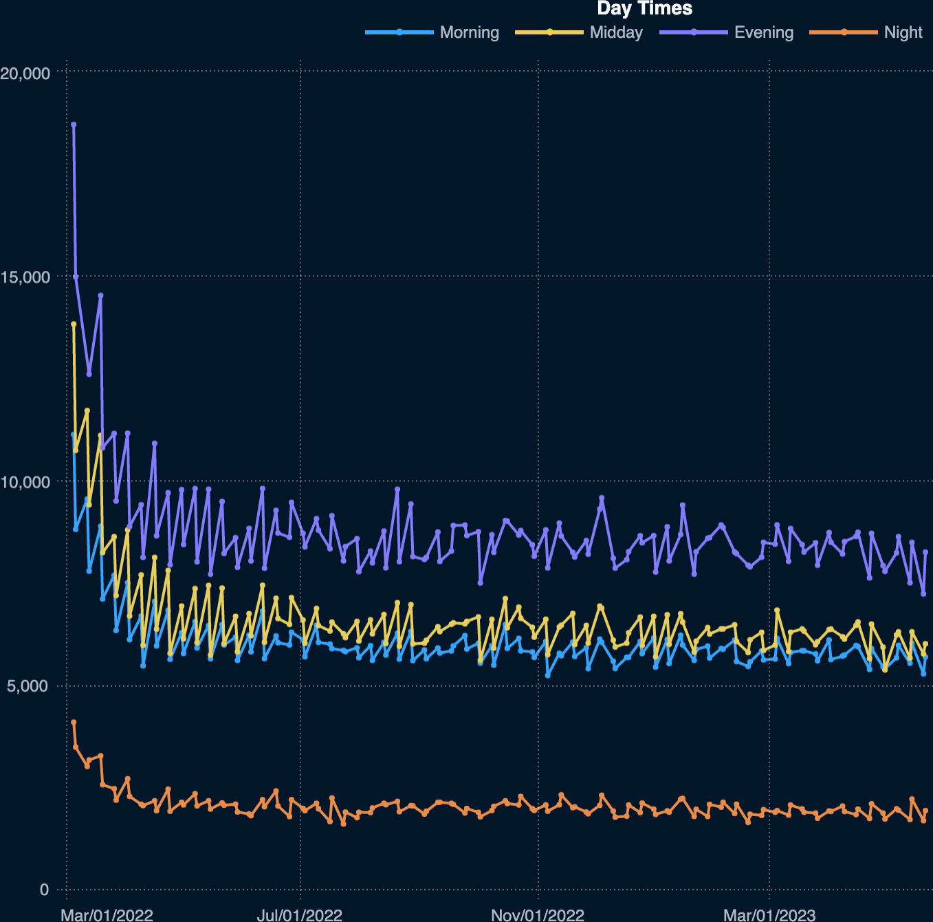
During weekdays the morning and evening traffic increases in August but decreases in February. Traffic levels for the remainder of the study period remain largely the same.
Participants without children spend more time (averaging about 4 minutes) at recreational or social activities on Tuesday, Wednesday and Thursday. The total number of activities on those days doesn't change significantly, just the duration. Recreational activities are three times as common on weekends as they are on weekdays.
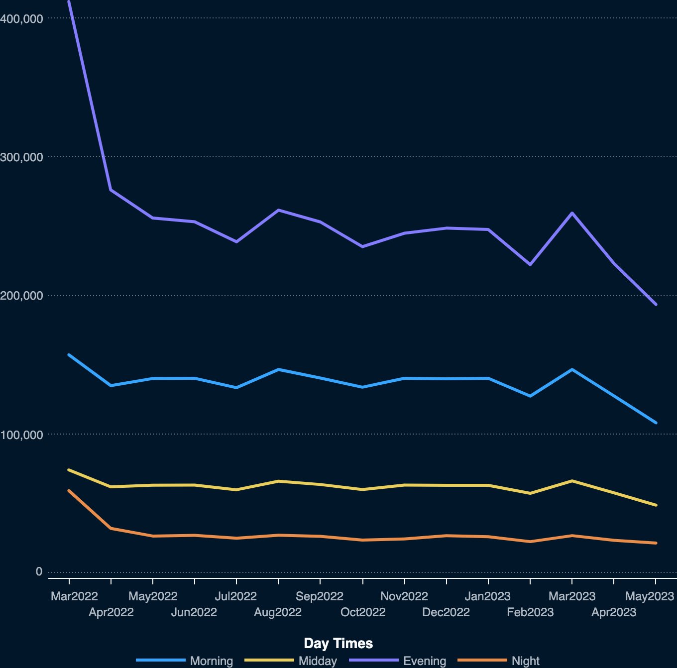
Total weekend traffic is highest in July, October, and April of 2023. However, weekday traffic is highest in August and March of 2023.
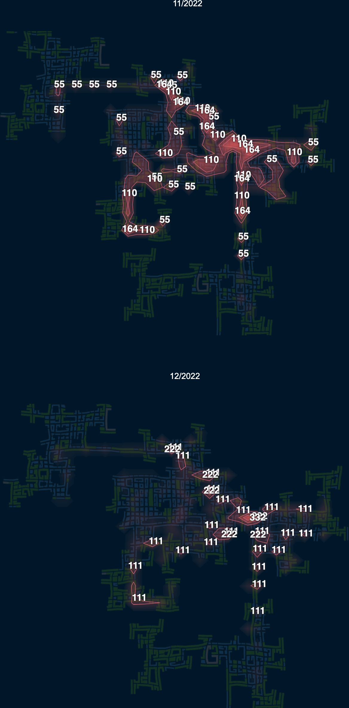
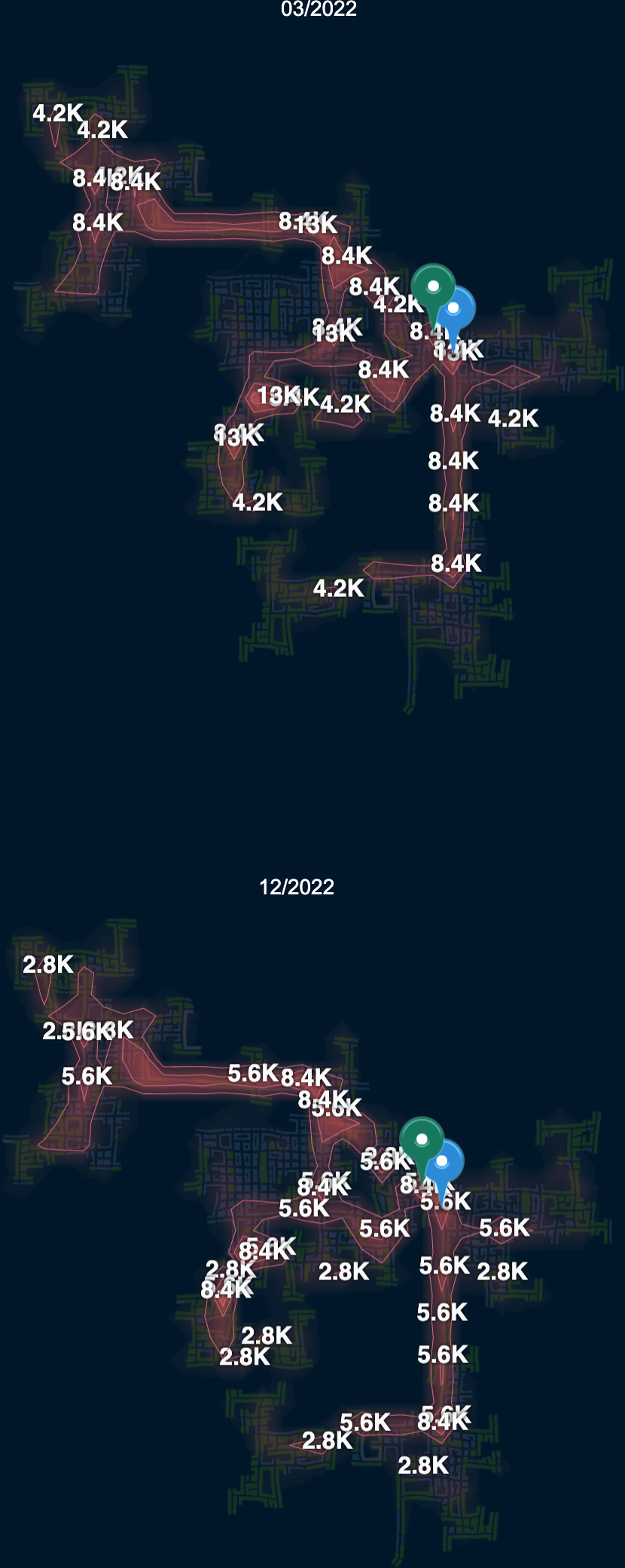
Traffic patterns don't show significant geographical changes during the study period. However, one can observe a slight change in traffic concentration in November and December. A hotspot for traffic congestion moves from one area to another (from the blue marker to the green in the following figure) indicating that some event may have been responsible for this temporary shift.
Participants with more than one job experience more variance in where they create high traffic areas due to the changing of jobs. November seems to be the peak travel activity for this group of participants but December is the lowest. These participants also typically only travel short distances, due to living closer to work locations.